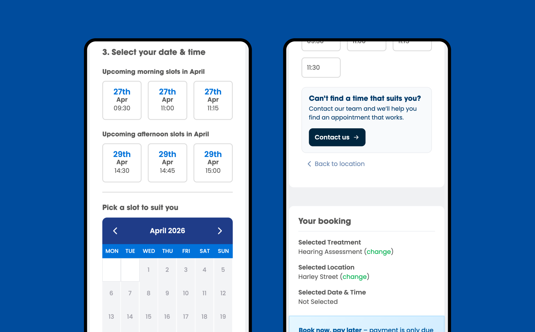
4 Slots available a month
Increase in clinic bookings following the redesign
Improvement in user comprehension of clinic locations
Users who could identify a location in a 10-second test
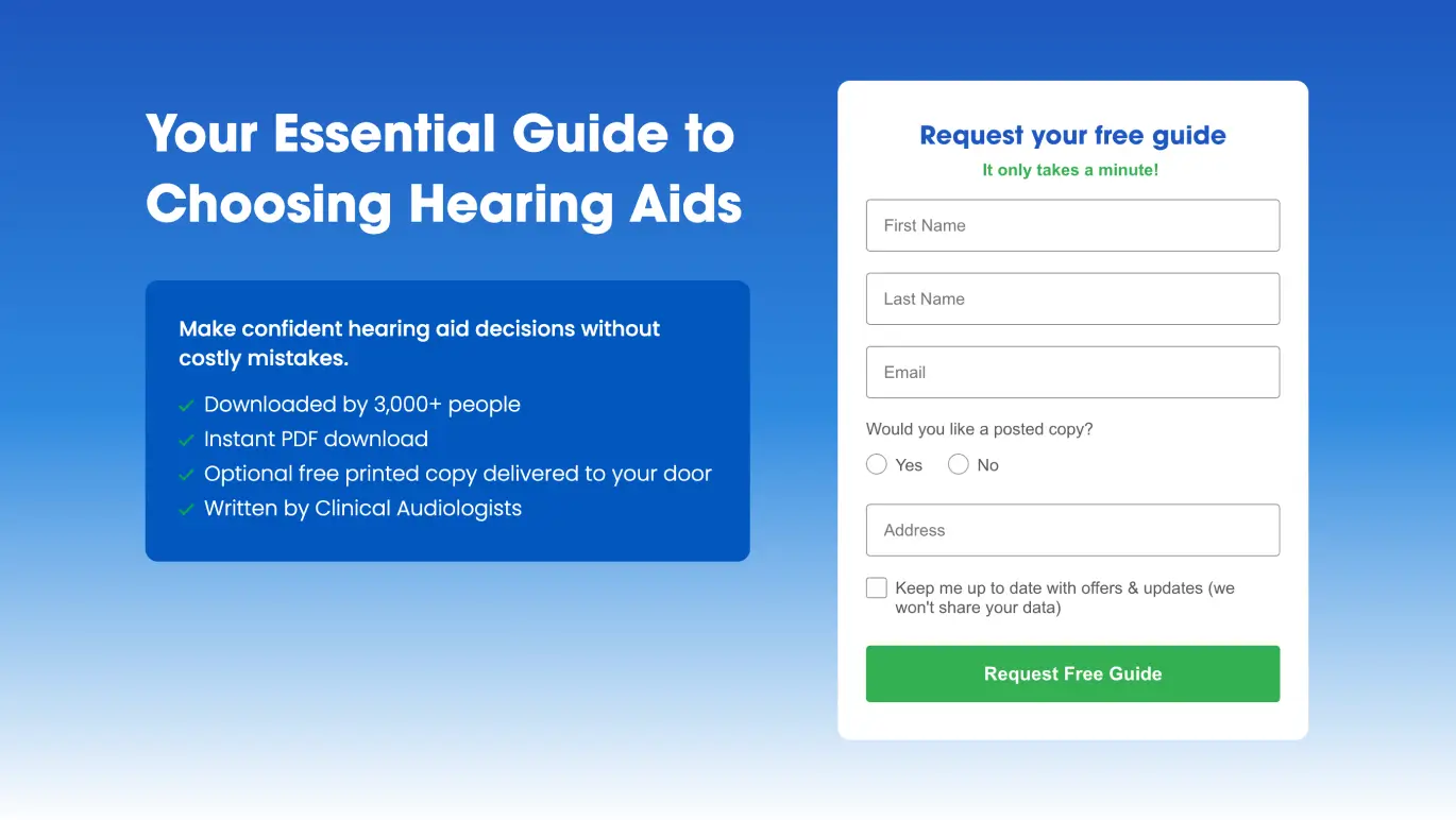
Pindrop Hearing came to us with a clear goal: more people through the doors of their clinics. The website was live, the brand was solid, and the service was excellent. But bookings weren’t where they needed to be.
Rather than assume we knew why, we tested it. We ran 10-second tests with 500 people — showing them the homepage for just ten seconds, then asking a simple question: where is this practice based, and how would you get there?
Fewer than 45% of users could answer confidently. That’s not a conversion problem — it’s a communication problem. If people can’t quickly understand where you are and how to visit, they don’t book. They leave.
The fix wasn’t a visual overhaul. It was a communication overhaul. We redesigned the homepage around one principle: make the most important information impossible to miss.
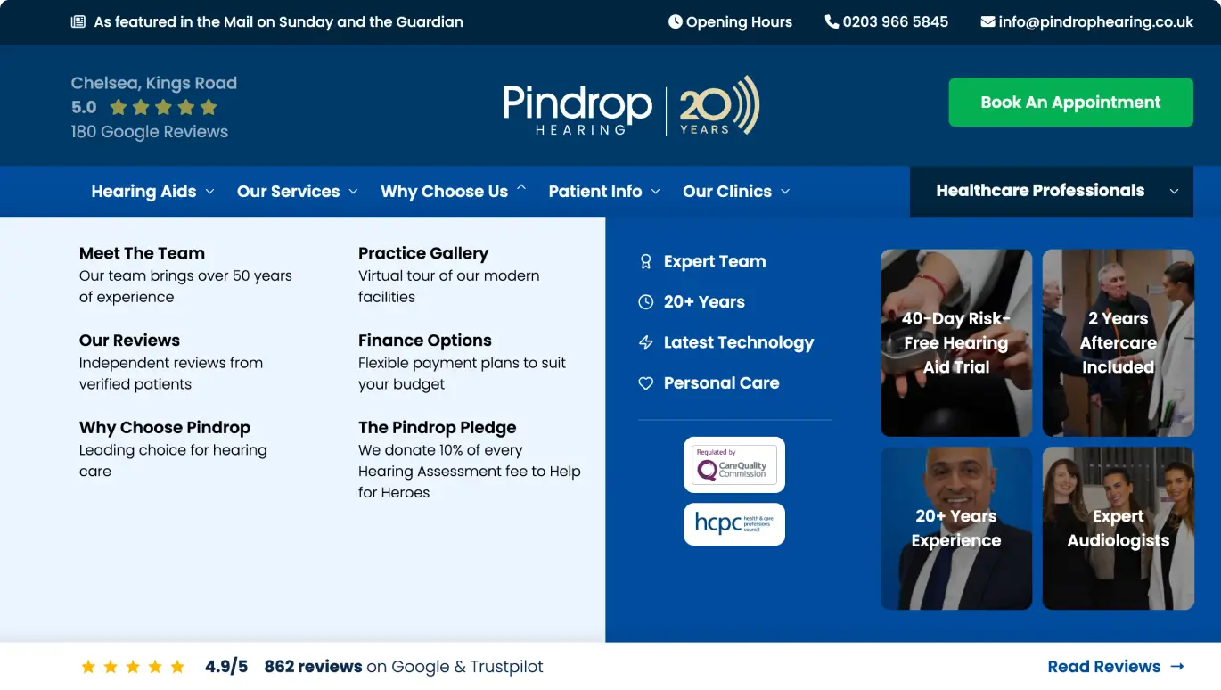
Location. How to get there. What to expect when you arrive. These became the architectural priorities of the page — not secondary details buried in the layout, but the first things a visitor sees and understands.
We stripped out anything that created friction between a visitor and that core message. No jargon. No ambiguity. Clear clinic names, clear directions, clear next steps.
Then we ran the same 10-second test again — new cohort, same question.
The booking numbers followed. A 67.5% increase in clinic bookings, driven entirely by removing the communication gap between what the business offered and what users actually understood.
The lesson is one we apply across every project: testing how real people understand your site beats guessing every time. It improves UX, builds trust, and turns the right kind of visitor into the right kind of lead.
4 Slots available a month