How We Simplified Complex Decisions and Boosted Leads by 159%
When too much information was getting in the way of conversions, we redesigned the experience to focus on clarity and what the user actually gets. The result? A 159% increase in leads.
The Challenge
Our client is a leading coaching organisation, training both individuals and companies across all levels. With over 6,000 trained coaches globally and a flagship programme costing over £6,000, their audience was ambitious professionals and organisations seeking personal development.
They already had a strong brand and healthy website traffic. The issue wasn’t awareness—it was clarity.
Their course was a significant investment, and while prospects weren’t doubting the organisation’s credibility, they were struggling to understand exactly what they would get from the programme. The website’s pages were overflowing with great content, but the sheer volume was overwhelming.
The client had identified their “Book Your Free Taster Session” as the ideal low-commitment next step in the buyer journey. Unfortunately, this wasn’t performing well, despite the traffic they were generating.
They knew they were missing opportunities. They just didn’t know how to unlock them.
Our Approach
We started by listening. Using heatmaps and sales funnel data, we tracked how visitors were engaging with the site. We also spoke to the client’s core sales team and reviewed testimonials and feedback forms to uncover what participants truly valued about the programme.
A clear pattern emerged: the content focused heavily on what the course was, but not enough on what participants would actually gain. This imbalance meant the sales journey was long and unclear.
So we flipped the story.
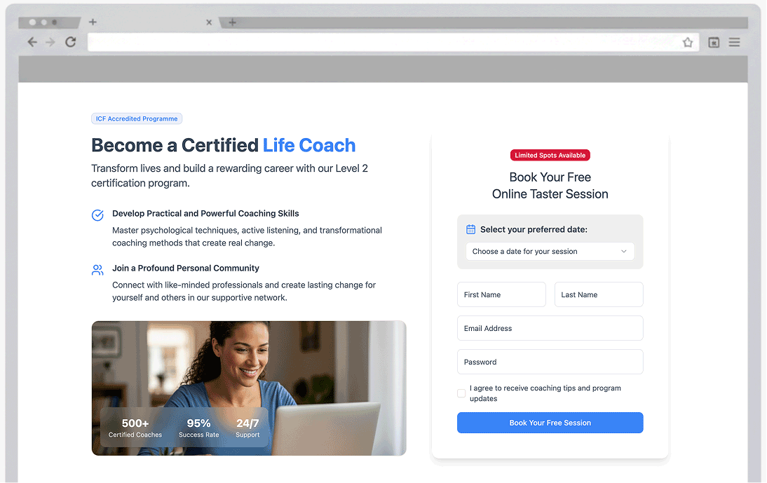
Step 1: Redesigning the banner
We rewrote and redesigned the banner, putting the benefits front and centre. Instead of “here’s what we do,” it became “here’s what you’ll get.” This single change immediately boosted leads by 65%.
Step 2: Redesigning the page
Next, we rebuilt the flow of the page itself. We structured it to answer the user’s core questions step by step, providing clarity while reducing cognitive overload. The content was rebalanced to highlight outcomes, not just features.
This second wave of changes almost doubled enquiries again—leading to a further 94% lift in leads.
The Results
The numbers speak for themselves:
-
+65% increase in leads from a redesigned banner.
-
+94% increase in leads from restructuring the page.
-
A total lift of 159% more leads from the same traffic levels.
With these improvements, the client’s “Free Taster Session” funnel became the strong, scalable lead-generation tool it was always meant to be.

Lessons for Other Businesses
This project reinforced a key truth:
Information overload kills conversions.
Even if you have a great brand and plenty of traffic, overwhelming your audience with too much detail can paralyse them. Prospects don’t just want to know what you do—they want to know why it matters to them.
If you run a UK business with complex or high-investment products, take a step back and ask yourself:
-
Are you showing what your user actually gets?
-
Is your page structured to answer their questions in the right order?
-
Could simplifying and clarifying your messaging make all the difference?
For this client, the answer was yes—and the results were transformative.
Could We Do the Same for You?
At UserBoost, we specialise in identifying friction in customer journeys and turning traffic into tangible results. If your site is generating visitors but not enough enquiries, let’s talk.
Start optimising your website
Get actionable insights to grow conversions and revenue.
Get your free 60min performance review