Behind the Boost: Survival Analysis for Time-to-Contact
Most A/B tests are designed to answer a simple question: Did more people convert in Variant A or Variant B?
That’s fine when decisions are fast — like clicking “buy now” on a t-shirt. But what about industries where people take their time? Think, for example, dental implants, Invisalign, legal services, private healthcare, or B2B contracts. In these cases, users may visit a website multiple times over weeks or even months before filling out a form.
If you’re only measuring “converted or not within six months,” you risk missing the bigger picture.
This is where survival analysis — and specifically Kaplan–Meier curves — comes in. It’s a statistical approach that helps you see not just if people convert, but when they do.
Why “Time-to-Contact” is Just as Important as Conversion Rate
In Considered-Purchase Brands, the sales cycle is rarely instant. For example, a patient researching Invisalign might:
-
Read about treatment options.
-
Leave and think about it.
-
Return weeks later to compare prices.
-
Finally, decide to book a consultation months down the line.
So, optimising each of these touchpoints is very important. However, most businesses want the sale, rather than looking at every touch point the user will take. Understanding users better means…..
Shorter time-to-contact = shorter sales cycle = revenue brought forward.
What is Survival Analysis?
Survival analysis is a family of methods used to study time-to-event data. Originally built for medical research (e.g., “how long patients survive after treatment”), it’s equally powerful in marketing and CRO.
In our context:
-
The “event” is a contact form submission (or enquiry).
-
The “survival” curve represents the proportion of users who have not yet converted at each point in time.
The beauty of this approach? You don’t throw away people who haven’t converted yet. Instead, their data is marked as “censored” — meaning we know they’ve survived without converting up to this point. They still contribute to the curve. And the better the quality of the information on the website, or by using different touch points like brochures, the more you can keep them interested.
Kaplan–Meier Curves in Plain English
A Kaplan–Meier curve is the simplest way to visualise survival analysis:
-
X-axis: time since the user’s first meaningful visit (days, weeks, or months).
-
Y-axis: the probability that a user has not yet converted (i.e., they’re still “surviving”).
Here’s how it works:
-
At day 0, everyone is unconverted (100%).
-
Every time someone converts, the curve steps downward.
-
If more people convert quickly in one variant, that curve drops faster.
By comparing two variants:
-
A steeper curve = users are converting sooner.
-
A flatter curve = users are taking longer, or fewer are converting.
You can also calculate the median time-to-conversion — the point at which half of your converters have enquired. For example:
-
Variant A: 50% of converters contact within 120 days.
-
Variant B: 50% contact within 90 days.
That’s a meaningful difference even if both variants reach the same 20% conversion rate at six months.
Milestones: Learning When to Help (Not Just How Much)
In long decision journeys, people rarely sit on the fence for six months and then suddenly enquire. They leave breadcrumbs along the way:
-
Downloading a brochure
-
Reading a treatment article
-
Looking at before/after galleries
-
Trying a finance calculator
We treat these as milestones. By studying when they happen by carry out user research, we can anticipate when intent heats up — and step in with the right information.
Visualising the Build-Up
The chart below shows how brochure downloads accumulate over time. Notice how a large share of users act around the two-week mark. That spike tells us this is when curiosity deepens.
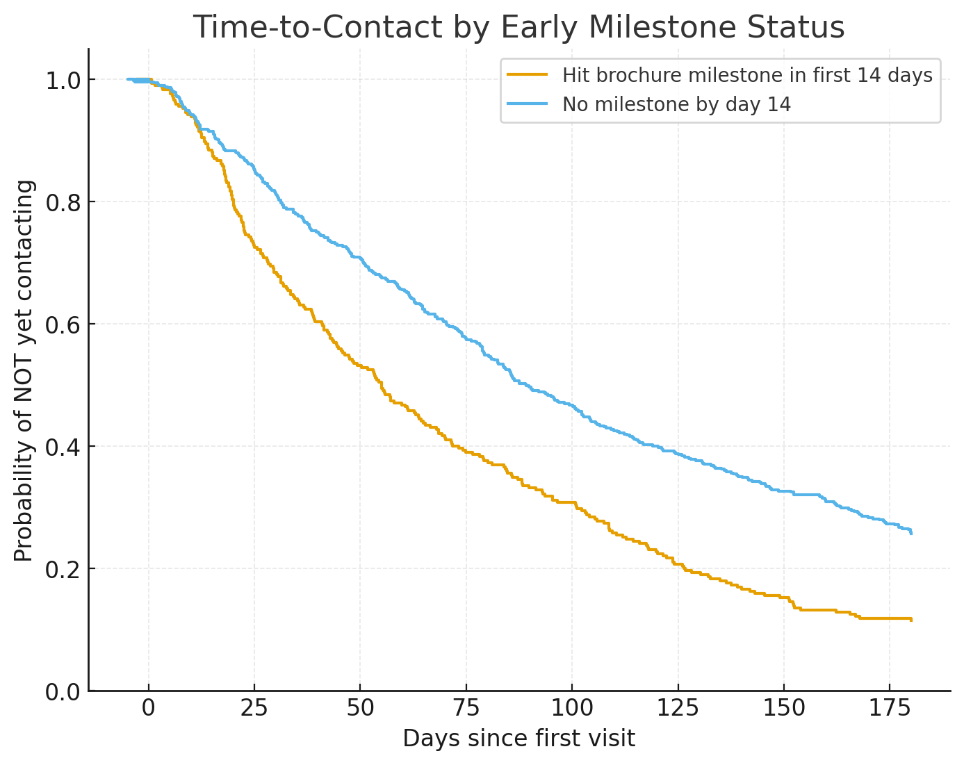
Chart caption: “Milestone Build-up — % of users who download a brochure over time. Peaks like this show when interest accelerates.”
Linking Milestones to Faster Contact
We can also split users into two groups:
-
Those who hit the brochure milestone early (e.g. within 14 days)
-
Those who didn’t
Plotting their Kaplan–Meier curves reveals a striking difference: the early-milestone group tends to enquire much sooner.
Chart caption: “Time-to-Contact by Early Milestone — users who downloaded a brochure within two weeks convert faster than those who didn’t.”
What This Means in Practice (Invisalign Example)
Suppose your Invisalign patients take six months on average to book a consultation. Survival analysis might reveal:
-
By day 14: many users download the brochure.
-
By day 21: some return to read a detailed article about treatment.
-
By day 90: a significant share finally decide to contact.
Armed with this knowledge, you can build interventions:
-
Before day 14: nurture with reassurance content — clinician expertise, safety, pricing ranges.
-
Around day 14: prompt with “Ready for your personalised treatment plan?” and capture emails.
-
If brochure downloaded but no contact within a week: follow up with FAQs or a virtual assessment invite.
-
If no milestones by day 21: offer softer engagement — smile visualisers, “send me costs,” or treatment stories.
The Metrics We Track
-
Median time-to-contact overall, and conditional on milestones (e.g., “brochure within 14 days reduces median time-to-contact by 28 days”).
-
Hazard ratio: how much hitting a milestone increases the likelihood of contacting at any moment.
-
Milestone coverage and timing: % of users who reach each step, and when.
-
Assist value: how often enquiries follow a milestone within X days.
Why This Matters for CRO
Survival analysis gives CRO specialists and marketers a richer story than a yes/no conversion rate. It helps you:
-
Spot differences earlier. You don’t need to wait for six months of data before seeing curves diverge.
-
Understand decision timing. Are people nudged sooner, or only after repeated exposures?
-
Align marketing with sales cycles. Faster conversions reduce lead nurture costs and accelerate pipeline.
-
Back stronger business cases. Demonstrating that your changes shave weeks off the average cycle can be just as powerful as showing a % increase in leads.
Behind the Boost
The real “boost” isn’t just more conversions — it’s conversions that happen sooner, and with a clearer understanding of the decision process.
Survival analysis shows us those hidden patterns: not just if users convert, but when and after what. By tracking milestones like brochure downloads or article reads, we can time our nudges and information to match user intent — giving them the right help at the right moment.
👉 Want to uncover your own milestones? Reach out, and we’ll show you how survival analysis can sharpen your CRO strategy.
Start optimising your website
Get actionable insights to grow conversions and revenue.
Get your free 60min performance review